There are a lot of custom Superior 100 pacing charts, graphs, spreadsheets and web based tools floating around out there, but the one that four time Superior 100 Mile winner and course record holder Mallory Richard created and shared with us is one of the more unique expressions of past runner data / split times that we have seen. As with any automated pacing chart that is outputting data based on a massive amount of input / detail and making complex calculations, please note that there could be errors, or over time, could fall into disrepair so before implementing any of this data into your own race plan, be sure to do some of your own calculations / checks as well to make sure this info makes sense for your particular race plan. Thank you Mallory for sharing and making this guest post! – Superior Trail Race
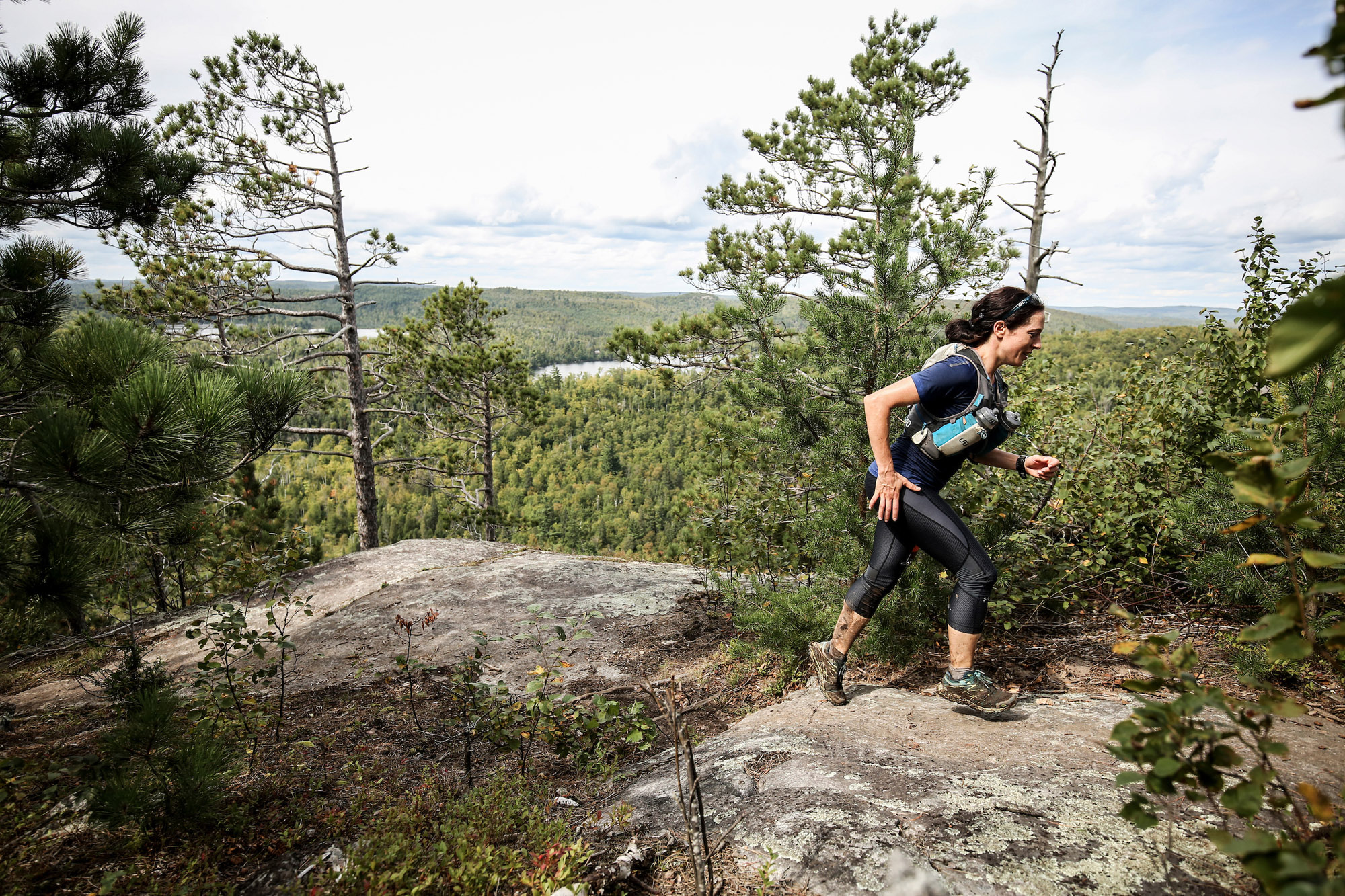
Mallory Richard at Mt Trudee – Photo Credit Ian Corless
In August 2019, race director John Storkamp issued a challenge to the trail community: “What skills do you have that can strengthen our events and in turn our trail community?”
Challenge accepted.
The Superior Fall Trail race is my favorite race and always the highlight of my season. I cannot exaggerate how terrified I was going into the race for the first time, and four finishes later I still have a healthy fear of the course. It’s easier to face that fear now because I have gotten to know some of the wonderful people the race attracts. Sure, the course is going to chew me up and spit me out, but there are hundreds of people out there who have my back.
So, when John called on all of us to contribute something new that would benefit the trail community, I had to get creative. I don’t live close to the trail, so it’s hard for me to do trail maintenance in the region. I can crunch numbers, though. I had been poring over the splits from previous years to figure out where I might be able to improve on my 2018 finishing time. I realized that with a little extra work, I could find a way to share my analysis with other runners.
Tableau is a visualization software product that I use at work. I took the public information on 100-mile splits (available HERE https://www.superiorfalltrailrace.com/splits/ ) for all runners since 2014 and created a master spreadsheet. From there, I used Tableau to calculate the number of DNFs at each aid station and the average pace and leg time between aid stations.
How to Use this Tool:
- Please note that this tool was designed for viewing on a desktop/laptop, as opposed to mobile devices
- If you have a goal time when you’d like to finish, you can use the “Finishing Time” filter to bring up the average paces for each leg and use those to plan your race
- You can use the average leg times to give your crew some more informed estimates of when you’re likely to arrive at the next aid station
- You can use the paces and DNF stats to anticipate which sections of the course are the most challenging
- If you hover the cursor over the question mark icon or the pace chart, you’ll get some additional information
Some Notes on the Methodology:
- Most years, there aren’t splits available for the aid station at Sonju Lake Road. Therefore, the split times for Crosby-Manitou reflect how long it takes to get from Finland to Crosby-Manitou. Similarly, if anyone dropped at Sonju Lake Road, I recorded them as dropping at Crosby-Manitou instead because that’s the next aid station where they should have had a split, but didn’t.
- I only used the splits of runners who finished the race when calculating average paces. I figured that their paces might skew the average if, for example, runners DNFed after starting out too fast or after getting injured and walking to the next aid station, their pace isn’t a good indicator of a steady pace that would get you a finish within your goal time.
- You’ll notice that the Finishing Hour filter rounds down. So, for example, if you aspire to a finishing time with a “32” in it and you’d be happy with 32:47, then the “32” on the filter will work for you. If, on the other hand, your goal is to finish under 32 hours, then you’re better off selecting “31.”
- I included the filters for year, age group, and gender for your curiosity. Filtering by year may help you if you want to see the average paces for a hot year, or a muddy year, etc.
I hope that you enjoy this. I look forward to seeing you at the race.
– Mallory Richard